How I shot it: Ashley & Aaron's rehearsal dinner portrait
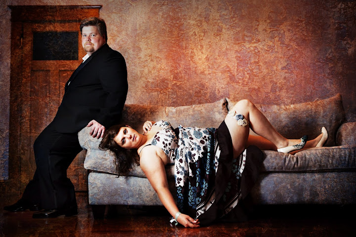 The wedding rehearsal was the day before the wedding, so we did some shots at the house. I had something in mind for this: I've been saving this photo from Marie Claire for months, waiting for the opportunity to try this pose (or something like it) with a couple. This was my chance!
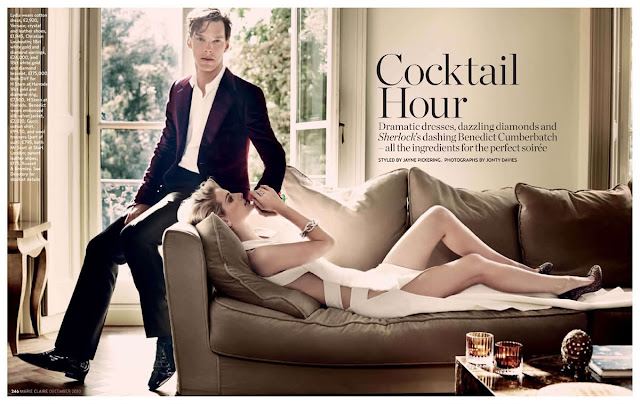 In the house where we stayed, we had a nice big neutral sofa - ideal. We didn't have a window behind it, or any way to arrange that - but oh well, i figured I could come up with something to make the wall interesting, and I was more interested in the pose than the lighting on this one.
On location
- I had Ashley get basically into position, and with a model in the frame, I had to make some camera decisions. First - light. It was late in the day and there really wasn't enough ambient light, unless I wanted to go for a super shallow depth of field:
 I didn't really like that, or the overhead light. So it quickly became clear this was going to involve my (single) Speedlite. We set it up with the Lastolite umbrella (shooting through) camera left - I think Jenna was sitting on the other sofa, holding it, actually.
 - First up was getting Ashley settled and posed on the sofa. We tried a few things. Very sexy indeed.


- Next, adding Aaron!
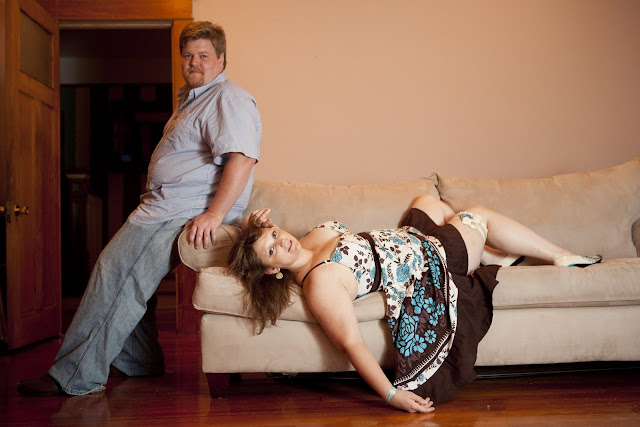
- Then, convincing Aaron to change into the tux he'd wear for the wedding the next day. That was a job in itself since it was hot and humid already. But - worth it.

- Then, working out the lighting. Now I messed with the position of the Speedlite (held by the lovely and talented VAL, Jenna) a bit. Too far to the side at first, but then we got it...


- Finally, I had the shot I wanted.

Post-production
At this point I had source material I liked, but I wanted it to look like a high-interest, high-fashion shot, and that was going to take some adjustments. I knew we needed a lot more contrast, and I was going to have to do something with the blank wall behind them. I could photoshop something fake in but I kinda just wanted to add an interesting texture. I guess the point is, I had a general idea, but my vision wasn't completely clear. So I needed to find the right texture(s) and prove my concept before I invested toooo much time in this.
- First things first: see how the right end of the sofa looks higher than the left end? That needed to be flat. I used the "warp" transform to fix that. I also painted out that weird black thing above the sofa arm on the right.

- Then I duplicated the layer, set the new layer's Blend Mode to Overlay, and set the opacity to 33%. This upped the contrast immediately.

- Okay great - now the people looked "right" enough that I could focus on the texture. I grabbed a bunch of textures I'd shot recently and just started trying them out, by copying them into my file as a new layer, setting that layer's mode to Overlay, and putting the opacity at around 50%. The idea was just to get an idea of what this would look like. In a perfect world I would use a texture from New Orleans, but I was open to whatever - so I brought in a bunch from Berlin as well. Here are the ones I tried:
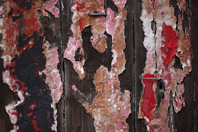
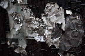


- Finally, I wound up taking these three - all from the same door in Berlin - and rubber-stamping around until I made a nice overall texture. These three:


 ...added up to this:
 ...which, when added to the source layer, made this:
 You might notice at this point that Aaron and Ashley look strangely paint-free. This is because I masked the layer so that there wouldn't be paint on them. Blue paint-skin does not look good.
 - Next I added initial Curves and Vibrance layers to the texture. These were set up as linked layers - like this:
 ...which got us to here:
 Using linked layers was important, because that meant that these new adjustment layers automatically affected only their parent layer - meaning, they made changes to the texture layer but didn't affect the other layers. In addition, and this is also very important, they inherited their parent layer's mask - so the adjustments didn't affect the people in the photo at all.
 - Then, an allover curves layer that dramatically increased the contrast and saturation:

- Next I made a Curves change to the wall (using a mask, of course) to make the wall look more interesting.

- The downside of that adjustment is that now Aaron's shadow on the wall, which at first just added a little depth, now looks super creepy. Time to fix that. I went back to the background layer. I fixed the shadow by:
- Use the magic wand tool to choose two colors: one light wall color (for the foreground color) and one dark wall color, from the shadow (for the background color). This allows me to easily toggle between light/dark colors by pressing the 'x' key as I paint.
- Chose a large brush with hardness set to 0 and opacity between 5-15% (changed that as needed as I went along).
- Painted the light color on the dark part of the wall, and also used the dark color to blend the lightened shadow into the wall a bit. Note that I didn't want to get rid of the shadow entirely - just make it less prominent.
- While I was at it, I did a little bit of work on two other things: some touchups on Ashley's arm, and I darkened her chest a bit because it was disappearing with the curves layers (see above).
Finally, I had this for my source layer:
 I also duplicated the layer, and re-did the Overlay layer from the beginning of this process.
 - Now I had to darken the sofa arm a bit - its brightness was competing with Aaron and Ashley. Here we are:

- Now we're almost there: I hand-painted in a vignette (by painting a mask on an exposure layer that darkened the edges).

- There's just one thing that's still wrong, and it took a little help from Lefteris to figure out what it was: the blue on Ashley's dress was too vibrant! It was killing the mood of the photo. Finally, a selective color adjustment that targeted that color made it all feel right.

- And now we're ready for the FINAL step: sharpening. I did this by:
- Creating a merged layer to sharpen.
- Sharpening it using the Unsharp Mask tool.
- Adding a layer mask hiding all.
- Painting in (on the mask) the places where I want to see the sharpened layer - basically just the details.
These are the parts I painted in:

Et voila, the finished image! I hope this (super-long) post is helpful and informative. Please feel free to leave comments with any questions!